
What better way to spend this quarantine than looking at pong statistics? Today, I am going to return again to the idea of “Wins Above Replacement” (WAR) for pong. You may recall a couple of years ago we touched on this topic, but calculating WAR on the level of the team. You can read the two installments on team WAR here:
Pong Wins Above Replacement, Part 1
Pong Wins Above Replacement, Part 2
The team WAR posts tried to answer the question of “how much better does this pair of players perform than we would expect a pair of average players to perform, given that the opponent team is made up of two average players?” The answers were not terribly surprising, with two time champions Nog+RJL coming out on top, followed by three other classic pong powerhouses in Kambour+Ezra, Bullets+Vool, and Sagar+Tufts. Granted, those results were based on data that is now almost three years out-of-date, which means it is about time to update the team WAR standings. But, I think, we are all more interested in the bragging rights afforded by calculating individual player WAR.
The player WAR tries to answer the question of “how much better does this player perform than we would expect an average player to perform, given that they are partnered with an average player and are playing against a team made up of two average players?” That is, if all four players on the table are “average”, we expect each team to win approximately 50% of the time. Here, we try to see what happens if we replace just ONE of those theoretical “average” players with an actual DKE and see how the win expectancy changes. All of the calculations are simulation-based, as described in the Part 1 post linked to above.
Before presenting the first results, you may be wondering why there was such a long gap between the derivation of the team WARs and the presentation of individual player WARs. First of all, you’re not my supervisor, so fuck off. Second, it turns out modeling and simulating a pong game on an individual level is FAR more complicated than doing so on the team level. When you are looking at pong at the “team” level, it is a pretty simple game. One team serves, and on that serve there are particular probabilities of things happening (UFE, hits, or sinks), and after the serve the two teams rally back and forth, and on each particular rally there are also particular probabilities of things happening. When looking at the team level, you aggregate the performances of each player on that team to come up with an idea of how that team performs on average (regardless of which player is actually taking the shot on a given rally, or taking a given serve).
However, on the level of the individual player, there are multiple games-within-a-game, and these change over the course of the game as the serve order advances. For example, let’s say Nog and I are playing against Kambour and Sagar. On the first serve, Nog serves to Kambour, but when Kambour returns the serve it is me, as Nog’s partner, that has to defend against any hit and then make a return shot, which will then be defended by Sagar. When the serves rotate after Nog and I go on a 5-0 run, Kambour serves to Nog, who hits it to Sagar, which then puts it on me to defend against Sagar’s shot and make a return shot which will be defended by Kambour. And so on, until Nog and I win 21-0. To put it more simply, at any given point during the game you may be defending against either the serve or rally of either opponent. I wanted my simulation to actually take into account these head-to-head match-ups that take place throughout the pong game.
So, then, without further ado, here are the calculated WARs, based on 1,000 simulated games, for 15 of our more frequent pong players (click to expand):
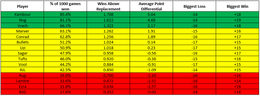
Since pong games by rule must be decided by 2 points, I highlighted as green the players whose average point differential across the 1,000 games was greater than 2 (indicating a significant tendency to win those games), yellow the players whose average point differential was between 2 and -2 (a proxy for a game being too close to call), and red the players whose point differentials fell below -2 (indicating a tendency to lose those games).
The top 2 players are not much of a surprise, with Kambour at 1 and Nog at 2, each expected to win over 80% of their games (corresponding to ~60-70% increased odds of winning any one game). Interestingly, though, it is Andrew Vrachimis who clocks in at number 3, winning 2/3 of his games, with 32.2% increased odds of winning any one game. What then follows is the big meaty middle class of pong players, with Marver, Conrad, Bullets, and Uzi all clocking in as winning over 50% of their games (but with low point differentials, indicating they are squeaking out those wins), with Sagar, Tufts, Vool, and RJL all losing slightly more than they win. At the bottom of the pile are Rup, Lambie, Ezra, and Big Scott Gordon, who are not looked upon favorably by this WAR model.
Before the shit-talking commences, it is important to point out that the major limitation of this approach is we don’t have a good way of defining an “average” pong player against which to actually compare anyone to. For this approach, I defined the stats (shooting %, sink %, save %, etc.) of an “average” player as being, intuitively, the average across all the pong players we have in our tracking data. The thing is, the only people that tend to play pong frequently enough for us to have stats on are players who are already good enough to want to keep playing competitively. In fact, of the 330 pong games we have tracked data on, 108 (32.7%) of these involve one or both of Nog, Kambour, or myself, which means are own stats are disproportionately driving what is considered “average”. It is no surprise, then, that this model tends to rate many fine pong players rather low, since they are essentially being compared to the upper end of the pong distribution. This is, unfortunately, a rather inescapable limitation of our data; the only ways around this would be to have some external standards for what statistics are sufficiently “average”, or to standardize the averages to the worst player in our data. The former is tricky and the latter is ungentlemanly.
That said, this bias only really dilutes the absolute meaning of “Wins Above Replacement”, but not the relative meaning. That is, every player is still being compared to the same benchmark; even if that benchmark is unreasonably high, it is equally unreasonably high for everyone. So it is still worthwhile to look at the relative standings of each player by this metric. Vrach coming in so high is a nice surprise, even if it is only based on 7 games. The combined WAR of the classic pong pairing of Vrach+Conrad (2.588) just beats out the combined WAR for Nog+RJL (2.558) and Ezra+Kambour (2.344). Still, these margins are razor thin (just look at the “biggest loss” and “biggest win” columns … it speaks to the basic chaos that is pong that even our highest WAR player is occasionally losing games by as many as 14 points, and even our lowest WAR player is winning by as many as 18). And our most recent championship combo was Nog+BSG, whose combined WAR (1.974) would be lower than that for Kambour with any other partner I’ve included here.
We can also use these numbers to come up with an expectation for how many games each of these players “should” have won of all the games we have recorded for them, and see to what extent individual players are exceeding or failing to exceed their expectation.
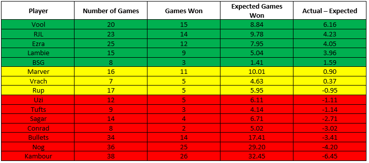
Now, this comes with the same caveats as before. These win expectancies were calculated based on having an “average” teammate, but as we discussed above our definition of “average” is heavily influenced by the games played by some combination of Nog, Kambour, and myself. For the most part, this table simply backs up the importance of having a good partner when you get to the table. That said, these results also back-up some of our intuition (as we frequently discuss on our pong pod). Sagar+Tufts are certainly an elite team, but one that has generally underperformed in many of our post-grad tournaments, which is reflected in these numbers, with them combined winning almost 4 fewer games than we would have expected based on their numbers. We also see what I like to call the “Vool bump”; he has won a staggering 6 games more than you would expect him to have won, and still almost 3 games more than you would expect once you factor in that I was his partner for all of those games. And that’s after he stopped putting spin on all his serves! Way to go, Vool.
This is just scratching the surface of what we can do with this individual WAR approach. As I’ve discussed at length, it’s difficult to come up with an absolute number for each of our players given the bias in our dataset. However, since the calculation is based on a simulation approach, we can begin to learn more about the game by abstracting the process. Rather than plugging in, say, Kambour’s numbers, we can start plugging in “artificial” players. For example, if we have four players who are all “average” offensively (event/sink rates, etc.) but just one of those players is elite defensively (e.g. has a save % one standard deviation greater than the average save % in our data), how much of an impact does just changing that ONE stat have on win expectancy? However, these analyses are for another day of quarantine.
ITB