Last month, I wrote a blogcat detailing the basic logic behind a computer-simulated pong game, and how we can use this logic to calculate Wins Above Replacement (WAR) for a given team. This time, I will present the results for this analysis, as performed on the data gathered during NogFest 2015. Before you read this, you should probably make sure you understand what I’m talking about by catching up on all of our previous blogcats on the subject:
The Beirut Blogcat
DKE Pong Rules & Regulations
The Brother Pi Breakdown
Pong II: Advanced Analytics
Don’t Doobie
NogFest 2015 Analysis: Player Performance
NogFest 2015 Analysis: Individual Games
NogFest 2016
Pong Wins Above Replacement, Part 1
As I discussed in Part 1, I created a computer simulation that essentially treats a pong game as a structured series of weighted coin flips. That is, when one player serves, a coin is flipped to decide whether or not they serve it off the table (a UFE), if they don’t serve it off there’s another flip to see if it hits the cup (an event), yet another to see if that event is a sink or a hit, and so on. This series of coin flips continues in sequences, with the weights corresponding to whichever team hit the ball on that possession, occasionally resulting in a point scored for one of the teams. As with real pong, the game is played to at least 21, with a team having to win by at least 2 points. To calculate WAR for a given team (say, Nog + RJL), all we need to do is set the weights for team 1 to be the observed frequencies of UFEs, hits, sinks, saves, etc. for that team during NogFest, while setting the weights for team 2 to be the average frequencies over all teams at NogFest. If we simulate this 1,000 times, we can see how many times Nog + RJL (from now on I’ll refer to them as NogJL) would be expected to beat an average team, given their observed performance at NogFest.
So, if this computer-simulated NogJL wins 877 out of 1,000 games, then their WAR is 877/500 (500 is the expected number of wins for an average team facing another average team, naturally), which is 1.754. We can interpret this as meaning that, for every game won by an average team against an average opponent, we would expected NogJL to win 1.75 games. In other words, they win about 75% more frequently than an average team.
Now, without further ado, here are the results for every team at NogFest 2015, ranked by descending WAR (click for a larger version):
I’ve colored in green the four teams that had above average WAR (i.e. WAR greater than 1), and red the five teams that had below average WAR (i.e. less than 1). The yellow row corresponds to the performance of an average team. We can see that NogJL lead the field with a WAR of 1.75, with an expected point differential of 5.81 points. Ezra and Josh (Ezbour from now on) come out in second place, with a WAR of 1.52, and an expected point differential of 3.65 points. I, for one, was surprised to see Ezbour beat out yours truly and his loving son, Vool, and by a pretty decent margin. According to the Net Rating that Josh calculated for NogFest 2015 (here), I had a net rating of 6.0, while Vool had a 0.8, giving us a joint net rating of 6.8; meanwhile, Ezbour had a joint net rating of 5.8. Which would imply that the two of us have a slight edge against them … however, net rating only takes into account the number of hits, sinks, points off saves, and UFEs each player had in a given game, while the simulation-approach for WAR looks at the game from a more holistic level (and directly evaluates performance against an average foe). What we can take this to mean is that, while Vool and I (Voolets) had a better tournament in terms of net rating than Ezbour did (they will probably blame this on the play-in game he is still bitter about having to play), if the tournament were played 1,000 times, they would be more likely to win more games than us across those 1,000 tournaments.
On the other end of the spectrum, Ben Paro and Scott Gordon (née Cool Hands) sit at the very bottom, with a WAR of 0.096 (which means that, for every 1 game an average team wins, we expect Paro + SG (BSG) to win … basically 0 games, losing by an average of 7.68 points every time. There’s not much to say here except … man, that’s bad. To look at net rating again, BSG had a joint net rating of -7.0 during that tournament, which is close to what their simulated expected point differential is here. Which means that we don’t expect them to have gotten unlucky in the tournament, but rather that their performance was a fairly good representation of what we would expected from them. (Granted, in their defense, their data for this simulation is based only on 2 games, both of which were against teams with above average WAR, which would naturally depress their numbers a bit. However, this caveat applies to all of the teams we are looking at here, as we have at most 4 games for evaluating any team, with most only having 2 or 3).
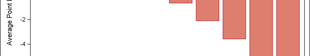
Here’s a plot of each team’s WAR:
Now, here’s another version of that plot, where I’ve colored green the “excess” WAR (that is, the degree to which that team’s WAR exceeds the average) and colored red the degree to which that team’s WAR is below the average:
As you can see, WAR and point differential track together (which makes sense, intuitively):
One thing an intelligent observer may have already wondered is how stable these figures are, for WAR and differential. After all, they are based on essentially a simulated series of coin flips, as I already described. Even if the true probability of a heads is exactly 50%, if you flip a coin 1,000 times, you aren’t always going to get exactly 500. Sometimes you might get 490, or 503, or even 395, depending on your luck. Simulations are, by their nature, stochastic, not deterministic. Now, there’s two major sources of uncertainty that impact our figures. There’s the natural variation that comes from flipping coins with a fixed probability, as I just described. However, there’s also the fact that the “fixed probabilities” we have used as weights in our simulation aren’t really very fixed. In fact, there’s a good deal of uncertainty around them; over the course of only 4 games, how good of an idea do we actually have as to a team’s true propensity to score, sink, save, etc?
The former source of uncertainty is easy to account for, by calculating a “confidence interval”. The second source of uncertainty is trickier to account for (and, at a certain point, we are simply limited by the data we have, and no amount of fancy statistical tricks can overcome that); I plan to do this in a future blogcat, which I’ll mention later. Confidence intervals, however, are simple and easy to compute. Conceptually, a confidence interval tells us that, accounting for the amount of variation we see over the course of the 1,000 games, what is the range of values within which we can be 95% certain the “true” value of the WAR (or point differential) lies? (The reasons for the 95% figure are related to rather esoteric statistical theory we won’t get into, here). That is, we calculated above that NogJL have a WAR of 1.754, but based on the variability present in our simulated dataset, our 95% confidence interval ranges from 1.711 to 1.793. So, we can be reasonably certain (conditional on how confident we are in the reliability of our data and the methods used in the simulation itself) that NogJL’s WAR is AT LEAST 1.711, and probably no greater than 1.793. Here is the previous table, updated to include these confidence intervals:
For the most part, this doesn’t change our interpretations much. We can see that even in the best-case scenario that BSG aren’t getting a WAR above about 0.125, for example. The two interesting comparisons that arise once we include these confidence intervals: between Voolets and Sagar + Tufts (Tungerlekar), and between Bob + Majowka (Big Jowks) and an average team. In the former case, we see that once we account for variability in the simulation, Voolets and Tungerlekar are performing approximately the same. That is, the confidence intervals for our WAR and point differential overlap, meaning we can’t be completely certain that they are different. So, while Vool and I performed better than Tungerlekar, it isn’t by a degree that could be considered statistically significant. Similarly, we see that Big Jowks, despite having slightly below average metrics overall, are creeping up on average with their confidence intervals, indicating that they are probably about an average team overall (but we’ll get back to these two claggarts later).
What I find especially interesting, and revealing, is looking at the last two columns in this table. “Biggest Loss” and “Biggest Win”. The former is the largest point differential by which that team lost over any of the 1,000 simulated games, while the latter is the largest point differential by which that team won over those games. While the win %, WAR, and point-differential all track together, we can see that biggest loss and biggest win don’t correspond as closely with the measures of overall performance.
Again, green refers to the degree to which that team is performing better than average, while red refers to the degree to which the team is performing worse than average. You can see that there isn’t as clear of a pattern; although the teams with below-average WAR tend to have worse losses and slightly narrower victories, it isn’t by much of a margin. And, oddly, Voolets, which was one of the top 3 teams (and the actual runner-up in the tournament) scores as below average for both, while Big Jowks (which is, at best, an average team as we just discussed) ranks as ABOVE average for both! Meanwhile, our top team in NogJL had an absurd +20 point differential (yes, they won that game 21-1. Though I checked the box score for that game and it was mostly due to an ungodly streak of UFEs on the part of the average team) for their best win, but their worst loss, at -15, is in line with what you expect from an average team.
This points to the fact that, at its heart, pong is a game of bounces. There’s just so much variability, only so much of which you can try to shape through skill or experience. Even the best teams get blown out now and then. Maybe you’re just a little drunk and can barely keep the ball on the table, never mind sink a cup; or maybe you get 15 hits but the other team just happens to save them all in increasingly improbable ways. There’s a lot of ways to lose a game of pong. Losing one game by 15 points can be humiliating, but in and of itself it isn’t much of a referendum on that team’s overall ability. There is, perhaps, another lesson here, though, more fundamental to the way the game is played. Let’s look at the average stats across all of these simulations for each team:
Here, I’ve done the coloring scheme a little differently. Yellow still denotes average, with green being above average and red being below average. However, now I’ve made these decisions separately for each column: shots, events, sinks, saves, and UFEs (for now, ignoring stats on serves and some other more specific stats to focus on the most essential ones). Each cell has the average (plus confidence interval) per-game numbers for that stat for each team across the 1,000 simulations. As you can see, generally speaking, the below average teams are below average on most stats, while the above average teams are above average. But there’s some other observations we can make, here:
1) Both Ezbour and Voolets have categories in which they end up below average (and Voolets have additional categories in which they are merely average). However, the category that Voolets are below average in (saves) might just be more significant. Ezbour are number 1 in saves/game in these simulations; notably, they are also above average in terms of largest margin of victory and largest margin of loss. Meanwhile, Voolets are below average in saves, and remain the only team with an above-average WAR that rank as below average in terms of both margin of victory extremes (3 of the other 4 teams that are below average by margin of victory are also below average in saves per-game). This may actually be an intuitive result: having a strong defense makes it more difficult to get blown out (even if you are having a bad offensive game, you are preventing the other team from scoring a lot of points) and may make it easier to blow out the opponent (if you are having a good offensive game AND preventing the other team from scoring any points). This may be evidence that saves per-game are a more crucial stat than any of the individual offensive categories.
2) On the other hand, NogJL are above average in saves (and, in fact, above average in every category except number of shots per-game, but this isn’t a reliable number as we will discuss later). They also have the largest margin of victory, with that absurd +20, but also have a losing game of -15. Maybe having the best WAR makes up for that, but it’s still interesting.
3) Big Jowks rank fairly well in most statistical categories, with the exception of UFEs. They have far and away the most UFEs among all teams, while being either average or above average in every other stat. In fact, if you notice, they are the ONLY below average team in terms of UFEs … which implies that their UFE rate is so low that it is actually dragging the overall average UFE rate down so far that every other team looks good by comparison. This may be the main reason that their WAR is so low, despite having an otherwise well-rounded game (and actually the second most number of sinks per game). You simply don’t win games if you are constantly hitting the ball off the table; it deprives you of a scoring opportunity while giving the other team a point.
You may have noticed one other strange thing about the table … the number of shots/game for the below average teams is incredibly low. Let’s take a step back for a second and compare the per-game stats for every team from the simulation, compared to their per-game stats from NogFest 2015. First, let’s just compare the average teams:
These numbers look pretty good! Generally, the simulated data slightly underestimates the numbers across the board, but this isn’t too surprising. The only data used for the simulation are the RATES that events occur (i.e. the proportion of shots that end in a UFE, etc.), not the raw numbers. If you do check the rates they come out looking more similar than the averages (e.g. the simulated average team had 15.3 events per game on 117.9 shots, for an event % of 15.3/117.9 = 12.98%, while the average team in NogFest 2015 had 17.4 events per game on 132.5 shots, for an event % of 17.4/132.5 = 13.13%). The event rates are all comparable, and it makes sense that the simulation is slightly underestimating the total numbers. If you recall from Part 1, there were a few simplifying assumptions I made in constructing this simulation: there are no saves-of-saves (i.e. a save can score a point, but the simulation has none of the save-hit-save sequences that tend to occur in good pong games) and there are no doobies (which lead to extra possessions without points being scored). Both of these are possible to include in the simulation, and I probably will in a future refinement, but for now the simulation performs pretty well without them.
Now, what happens if we look at the teams with above average WAR and compare their simulated averages with their observed averages?
Pretty similar story. The simulation slightly underestimates the raw per-game counts in most cases, but corrected for the number of shots the rates are all fairly comparable. The saves per-game estimates have a tendency to be more conservative than the other per-game estimates compared to the observed numbers; part of this is due to the lack of saves-of-saves as I mentioned above, the other part of this is that the simulation is designed to be against an average opponent, which depresses the number of save opportunities available in the first place. Save opportunities are highly contingent on opponent: in the four games Ezbour played in the real tournament, they had 1, 9, 12, and an astounding 31 combined saves. The 1 save came against BSG, who only “provided” 3 save opportunities for Ezbour, in part because, as we saw from the WAR calculations, BSG are almost impossibly terrible at pong (despite the 1 save, Ezra + Josh won that came 21-3). The 31 saves came against Tungerlekar, a top 4 team by WAR, who provided Ezbour with 38 save opportunities.
Side note: 31/38, or an 81.6% save rate, is a pretty astounding defensive performance, especially coming in a 21-19 loss. If it’s any consolation to Ezbour, their WAR suggests that 2 point loss was a fluke and they would be expected to win that game more often than not, and the primary reason they lost wasn’t their defense but a lack of offensive production. Out of curiosity, I ran a 1,000 simulations of Ezbour and Tungerlekar head-to-head, and Ezbour won 54% of those games. At first I was surprised that the match-up was so close, given Ezbour’s higher WAR, but the more I look at each team’s numbers the more it makes sense. The team with higher WAR will always have an edge, but the difference between ~1.5 and ~1.2 isn’t that large, given their per-game stats are all fairly close, which means the “underdog” always has a pretty good chance of victory. These numbers also revealed something interesting mathematically: if we take the ratio of the WAR for Ezbour and Tungerlekar, we get 1.522/1.236 = 1.231; now, I took this number and divided it by 1 plus itself, that is 1.231/(1+1.231), which equals 0.55, or 55%. That this is really close to the 54% result I just mentioned is not a coincidence, it’s actually showing an interesting mathematical relationship. I won’t get into the weeds of the details, but what this implies is that we can interpret WAR directly as the odds of winning a game against an average opponent, and by taking the ratios of WAR between two teams we can then get the odds of one of those teams beating the other (and from odds we can calculate probabilities using the formula probability = odds/(1+odds)). I’ll present more head-to-head results in a future blogcat, but for now this means that we can directly compare WAR results between teams and interpret them in an intuitive way. The WAR ratio for Ezbour vs. Tungerlekar is 1.231, which means that Ezbour are 23.1% more likely to win a game between the two teams. The ratio for NogJL vs. Voolets is 1.366, meaning they are 36.6% more likely to win that championship game if it were played again than to lose it. But we’ll get back to this, and break it down more, in a future blogcat.
Now, when we look at the bottom 5 teams, we start to see some interesting discrepancies from the real results:
Big Jowk’s stats look reasonable, but the bottom 4 teams all seem off, most notably in the number of shots per-game. The simulation is giving each of them an average # shots less than half of what they actually had per-game during the tournament. A lot of the rates end up being reasonable similar, but in some cases (especially with events per-game), the simulation actually seems to be overestimating the number of events they have relative to the number of shots. What is going on, here? I have a couple of theories, but to be honest I find these results to be fairly surprising, and as I continue to refine the simulation this is an issue I will keep an eye on trying to resolve.
One issue is that we should take the number of shots per-game with a grain of salt. My simulation wasn’t designed with the intention of tracking each team’s number of shot attempts, it only tracks the TOTAL number of shot events in the game for both teams, which I simply divided by 2 to get approximate estimates for each team. Simply dividing by two isn’t strictly correct, as the flow of the game doesn’t truly distribute the shots perfectly evenly between the games, but it’s close enough for an approximate number. For example, in the Ezbour vs. Tungerlekar game I mentioned previously, Ezbour had 257 shots, while Tungerlekar had 278. On the other end of the spectrum, Ezbour had 56 shots against BSG, who had 57 shots in that game. And these numbers point to the other possible reason for this discrepancy: these below average teams are simply losing so quickly in the simulations the game is over before they get up a lot of shots. Just as the Ezbour vs. BSG game was a quick and tidy 21-3 rout, the below average teams are just being outplayed by the average team. These factors, combined with the aforementioned tendency of the simulation to underestimate total game length in general, seem to lead to below average teams getting beaten pretty quickly in these simulations. There’s also the caveat that these teams are only “below average” because, for the most part, the only data we have from these teams is from games where they lost to NogJL or one of the other top teams in the tournament, which naturally makes them look worse than they probably actually are (except for BSG … anyone who has seen them play a game of pong will think a WAR of 0.096 might actually be an overestimate for them. They’re really bad. I love you guys but … stick to beirut).
Since this blogcat is already posting in at close to 4,000 words, I’ll wrap things up by asking: what’s next in the high octane world of pong analytics?
As we can see from all of these results, the simulations in general perform pretty well. There are a few issues which I will look into related to the underestimation of total shot attempts, but for the most part the simulations faithfully recapitulate the relationships we observed in the real pong games, while also offering us some interesting new insights. There are a lot of interesting directions theses analyses can go:
1) As I mentioned previously, I’m already starting to look at head-to-head simulations. That is, instead of calculating WAR by simulating against an average team, we can look at how often Ezbour would beat Tungerlekar, or how often Big Jowks could beat Brieler, etc. This might reveal to some interesting match-up specific differences. More generally, though, it allows us to simulate the tournament itself! I can set up a simulated tournament bracket and run THAT 1,000 times, and see how often NogJL end up as the champion, and how often the other teams advance. As I mentioned above, Ezbour would beat Tungerlekar head to head X% of the time, so do we expect that in most of the simulations they will advance further than they actually did?
2) As an extension to above: if we can simulate NogFest 2015, we can also try to predict NogFest 2016! That’s one reason I haven’t been using any data from the more recent tournament, focusing exclusively on the first one. Ultimately, we want to be able to predict the likelihood of a certain outcome a priori. Once the simulation is perfected, we can use the data from NogFest 2015 to predict what we expect the outcome to be for NogFest 2016 by simulating the bracket for the latter using the results from the former. This is complicated SLIGHTLY by the fact that there were teams from NogFest 2016 that weren’t there in 2015, but these gaps can be at least partially filled in using data from the DKE Open, and in the absence of data for a team simply setting them to average. By comparing a NogFest 2016 simulation using the 2015 data to another NogFest 2016 simulation using the actual 2016 data (and to yet another simulation in which we will pool the data from both tournaments, at least for those teams that played in both, because the more data we get for a team the more confident we can be about our estimates of their various statistics), we can start to get an idea of how robust this simulation is. The more closely these results correspond, the more faith we have that our model for how pong works is accurate.
3) Simulations are time-intensive. It takes about 15-20 minutes to run the 1,000 pong games for any given match-up. As I alluded to earlier, the fact that we can interpret WAR as an odds ratio means that we can start to make comparisons between different teams based on their WAR without having to actually simulate the head-to-head match-up (though in my next blogcat I am going to go into this in more detail, so stay tuned!). Ultimately, I’d like to take this a step further, and calculate win-odds/win-probabilities for each individual statistic. That is, what is the effect on your win probability of making one extra sink than the opponent? One extra save? One extra UFE? Our simulation will let us make these calculations in a couple of different ways: we can do simulations between two teams that are evenly matched on all characteristics except one (say sinks), and let that one characteristic vary over a range, and see how the WAR is impacted by the changes in just this one statistical category. We can also fit logistic regression models to the simulated games, which allow us to calculate the win-odds for specific statistics while simultaneously adjusting for the impact on win-odds of other statistical categories. Ultimately, I want to use both of these techniques to come up with a LIVE win probability measurement, akin to what they have during NFL games. That is, at any given point in the game, we can say “what is the probability that team 1 wins this game against team 2?”, and this probability will be updated with every event that occurs for either team.
4) There’s no I in team, but let’s face it, all of us narcissistic frat bros really just want to know how good WE are at pong for bragging rights. That is, we want INDIVIDUAL WAR, not just team WAR. That is, if we give Nog an average team-mate, and play that team against an average team, how often does Nog’s team win? This would be a measurement of his individual WAR. If we can calculate this for every player, not only do we open up entire new dimensions of shit-talk, but we can also start to predict how any arbitrary combination of players will fare against each other. For example, we know that NogJL are a better team overall than Ezbour; but what about Nog + Josh vs. Ezra + RJL? Or Nog + Ezra vs. Josh + RJL? With individual WAR, we can actually make some predictions about these relationships (and hopefully go on to confirm these predictions by just playing a lot of pong). Once we are confident in the team-level simulation my past two blogcats have discussed, I can begin to develop a player-level simulation. Conceptually, the two are similar, and there’s no reason we can’t do it at the player-level. The only barrier is complexity: my code to run a single simulated pong game is about 340 lines long, which balloons to a total of about 1,500 lines of code to simulate all the games for each team and then calculate the WAR and other statistics I’ve talked about (plus create the plots/tables in this post). Converting this to a player-based simulation will more than double the complexity: not only do we need to track and calculate all the events at the player level, and weight the coin-flips differently by which player is making the shot at that time in the game, but we also need to take into account an additional structure of the game that gets glossed-over at the team level.
To see what I mean, take a look at this diagram. It represents a pong table, with team 1 on the bottom and team 2 on the top. Each team has two players, A and B.
If player A serves the ball, then all the coin-flips related to the serve are based on player A’s (let’s say Ezra’s) statistics. Player A serves to player A on team 2 (let’s say Nog). So the next series of coin-flips is based on Nog. Nog hits across the table, and the next player is player B on team 1 (in this case Josh), who then hits it to player B on team 2 (RJL), and so on. So for Ezra’s serve, we have a set sequence of players, and we can mathematically figure out which player’s statistics to use on a given shot by simply looking at how many shots have occurred so far on the rally. That is, if the serve is shot 0, then shot 1 will be Nog, shot 2 will be Josh, shot 3 will be RJL, shot 4 will be Ezra, and shot 5 will be Nog again.
That is, Nog will always be the “shooter” on shots 1, 5, 9, 13, etc.. Josh will always be the “shooter” on shots 2, 6, 10, 14, etc. RJL will be the “shooter” on 3, 7, 11, 15, etc.. Ezra will be the “shooter” on shots 4, 8, 12, 16 etc. So, each player’s “shot” can be coded as being a multiple of four, offset by their place in the “shot order” decided by the serve. That is, since Ezra is serving, his shots are all multiples of 4. Since Nog is receiving, his shots are all multiples of four offset by 1. Josh is offset by 2, and RJL by 3.
However, let’s say that it’s RJL (team 2 player B) serving the ball. RJL serves to team 1 player B (Josh), who hits it to Nog (team 2 player A), who hits it to Ezra (team 1 player A). Now, it will be JOSH that’s the “shooter” on shots 1, 5, 9, 13, and so on, and Nog will be the “shooter” on shots 2, 6, 10, 14, etc. So we are still using offset multiple of 4 to track each player’s shots, but now which player gets which offset has changed, because the “shot order” has changed with a different server.
That is, coding the game at the player-level requires the use of conditional modular arithmetic, which also requires making specific assumptions about which side of the table each player is on relative to the others. I’ll go into all of this in more detail in a later blogcat, once I’ve finished creating my player-specific simulation, but I just wanted to give you a brief window into the fun and frustrating world of computer simulated pong.
That’s all in the future. Next time, I’m going to present the results from head-to-head team match-ups and a re-simulated NogFest 2015.